TOUCHTUNES
Redesigning Musical Jukebox
May - 2023
UX | UI App Redesign
The study uncovered a key challenge: new users were not returning after their first credit purchase or song selection on the jukebox platform. While the existing interface functioned, it presented navigation challenges and usability gaps that affected retention.
To tackle this, I led the redesign, focusing on streamlining navigation, enhancing usability, and optimizing the overall system experience—ensuring a more intuitive and engaging user journey.
Role
Lead Product Designer
& Researcher
Responsibilities
User Interface Design
User Research
Product Development
Problem Statement
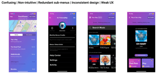
The TouchTunes interface presents a challenge for new users, often leading to confusion and frustration—especially for those unfamiliar with features like the song queue, navigation system, and music search. These usability gaps disrupt the experience, making an otherwise exciting music platform feel unintuitive.
As a result, user retention drops among new adopters. To address this, I focused on simplifying navigation, improving consistency, and enhancing the overall user journey—creating a seamless and enjoyable music discovery experience.
Stakeholders
Bars & Restaurants: The heart of TouchTunes, These venues provide the physical spaces where the platform comes to life, shaping the user exep.
Music Labels & Artists: The backbone of the app, They supply the licensed tracks that make music discovery and sharing possible
Users: The core of TouchTunes! Their experience and satisfaction drive the app’s success, making intuitive design crucial.
Payment Processors: Seamless transactions matter. Payment gateways & credit card companies enable hassle-free song selections through the app.
Hypothesis
Streamlined Navigation – Simplifying the menu structure and removing redundancies creates a smoother, more intuitive user journey, leading to higher engagement and fewer negative reviews.
Smart Music Recommendations – Integrating personalized music suggestions enhances discovery, making the experience more engaging and boosting user retention.
Consistent Design – A cohesive, visually polished interface ensures seamless interactions, improving user satisfaction and overall experience.
By implementing these design improvements, I helped create a more intuitive, enjoyable, and engaging music platform.


Current UI


Methodology
To understand user pain points, we conducted nine in-depth interviews with existing TouchTunes users at partner bars.
Structured Conversations – Each interview included 8-10 core questions, with follow-ups based on user responses.
Real-World Testing – We shared app sketches to gather direct feedback on potential improvements.
This hands-on approach provided valuable insights that shaped the redesign, ensuring a more user-friendly and engaging experience.
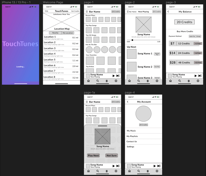
Lo-Fi Sketches


Lo-Fi Test Insights
Personalized Music
6/9 participants recognize that the main reason for using the app is to choose the music it sounds at the venue.
UI Issues & Frustrations
7/9 people consider that the app UI is sometimes frustrating and that can be improved by simplifying it.
Music and Genres Limitations
5/9 Users consider that the app has music and genre limitations like music not being available among others.
Lack of Information
6/9 users consider there is a lack of information in general about the app. It doesn’t teach you a lot of things.


Mid-Fidelity Wireframing
My goal was to create a seamless and user-friendly interface by:
Simplifying Navigation – Making it easier for users to explore the app effortlessly.
Enhancing Search – Improving song discovery for a faster, more intuitive experience.
Optimizing the Song Queue – Providing clear visibility and better control over song selections.
By focusing on usability and efficiency, the redesign ensures a smooth, engaging, and frustration-free experience for users.


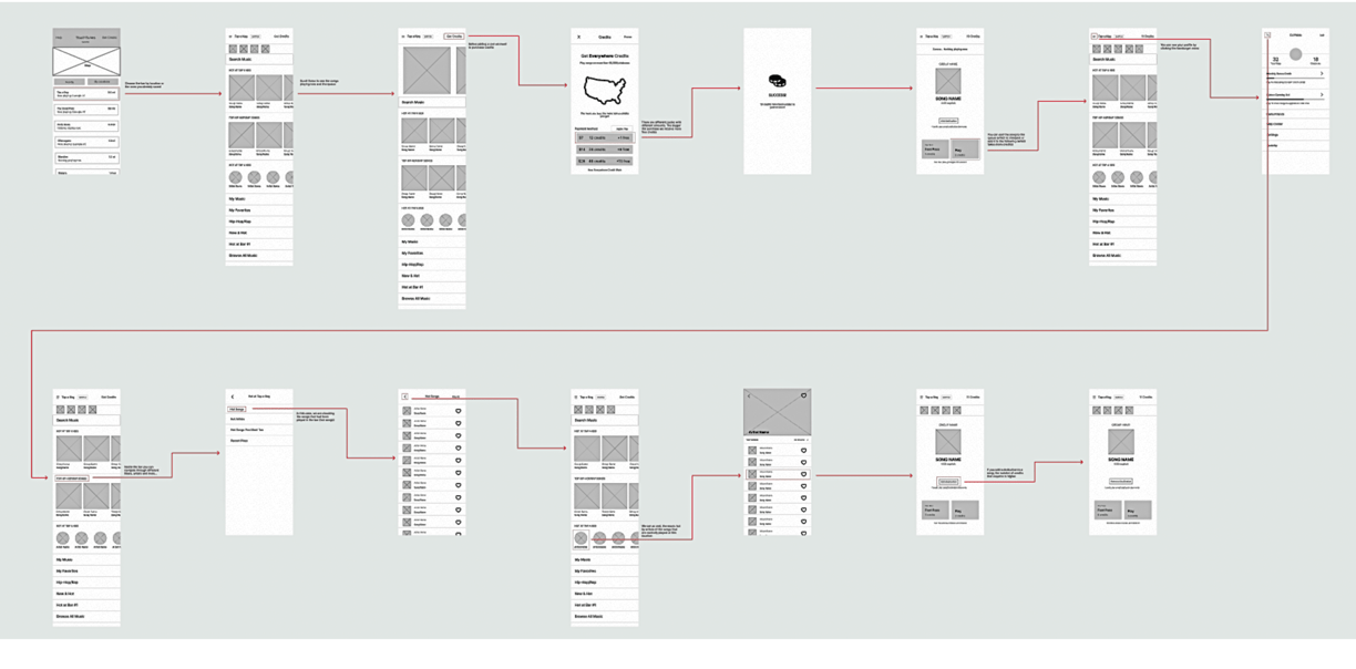
Hi-Fi Prototype Walkthrough
Features
Home Screen with Vertically Scroll & Dynamic Elements
Universal Design – A streamlined, intuitive interface ensures effortless navigation for users of all ages and backgrounds—no learning curve required.
Transparent Song Queue – Songs now appear in the exact order they were selected, removing confusion and eliminating hidden payment barriers.
This redesign makes the music experience smoother, more inclusive, and frustration-free for everyone!
Smarter, More Organized Search
Enhanced Search Bar – Now positioned right below the bar name and remaining credits for quick access.
Structured Results – Instead of a cluttered list, search results are now categorized into Songs, Playlists, and Artists, making discovery faster and more intuitive.
This improvement ensures a smoother, more efficient music selection experience!
Improved Readability
Consistent & Intuitive Design – A clean, structured layout enhances ease of use.
Left-Aligned Elements – Improves rapid scanning for smoother navigation.
Clear Typographic Hierarchy – Adjusted font sizes and weights to highlight key information.
This redesign ensures a visually balanced, user-friendly home screen for seamless interaction!
Adding Navigation Bar
Ensuring a constant and readily available set of navigation choices for accessing home, playlists, and account settings.

Library/Playlist Curation
Underused Feature –Interviews revealed that users rarely engaged with this function due to its overly complex design.
Simplified Navigation –Eliminated redundant nested menus that caused confusion.
Customization Options – Added personalization features to make the experience more engaging and user-friendly.
This redesign transforms the feature into a seamless & appealing tool for regular use!
A/B Testing Insights & Design Impact
Improved User Experience – 85% of new users found the updated queue card design resolved their confusion about song order, making the app easier to use.
Increased Engagement – Users spent 20% more time on the app, especially during playlist curation, with many lingering to explore beyond their song requests.
Seamless UI Enhancement – A simple visual update significantly boosted interaction, highlighting the power of thoughtful design choices.
Objectives
Simplify the menu hierarchy
Provide clear guidelines for navigation
Eliminate redundant menus
Create a clean and modern app interface
Improve the overall user experience
